PATAND-267: Update other consent layout#224
Conversation
|
I noticed a few inconsistencies. Comments incoming. |
|
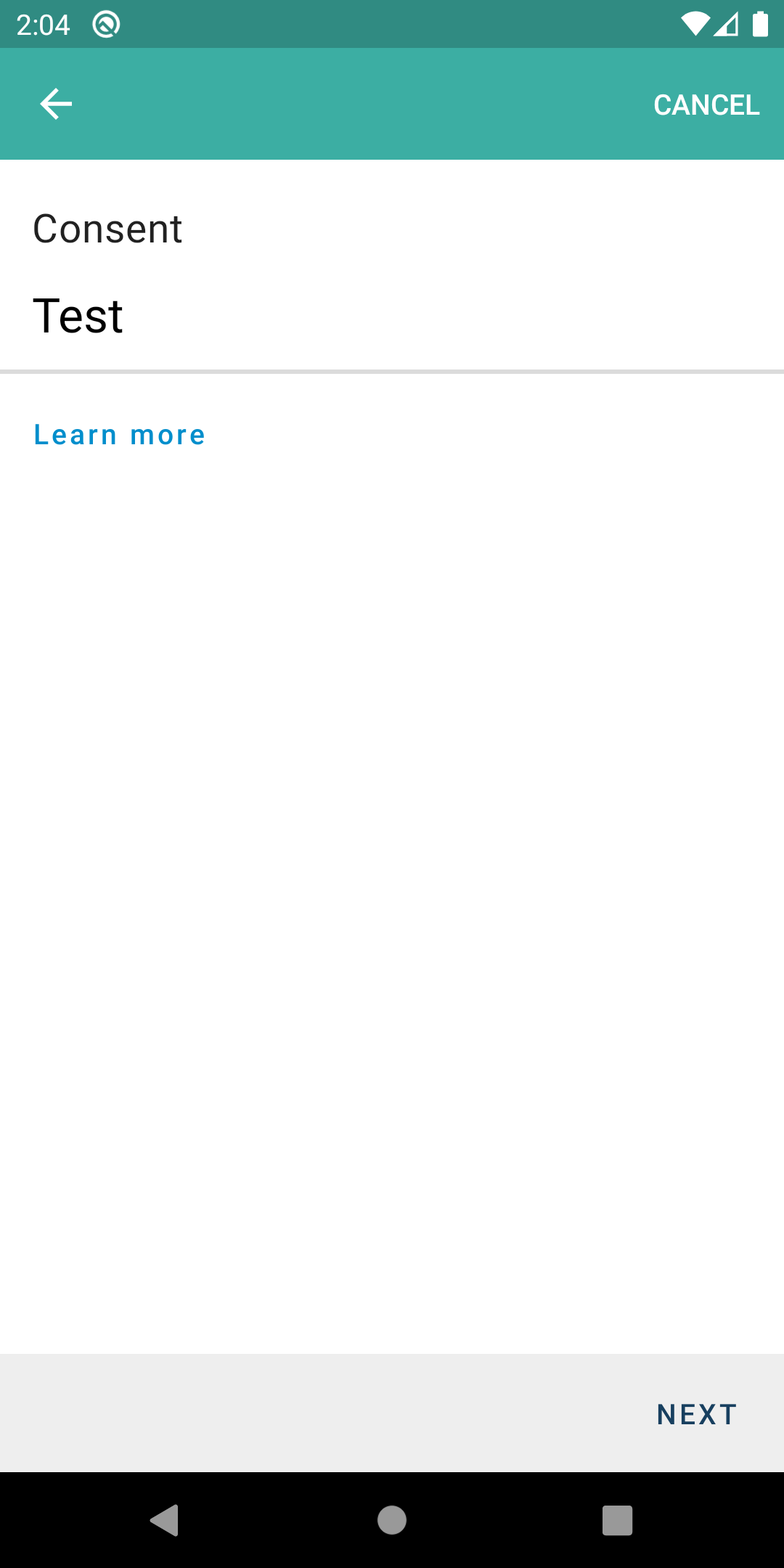
First Consent Page. Expand the image below to see it. I'm always comparing to this zeplin compo and similar ones. Details
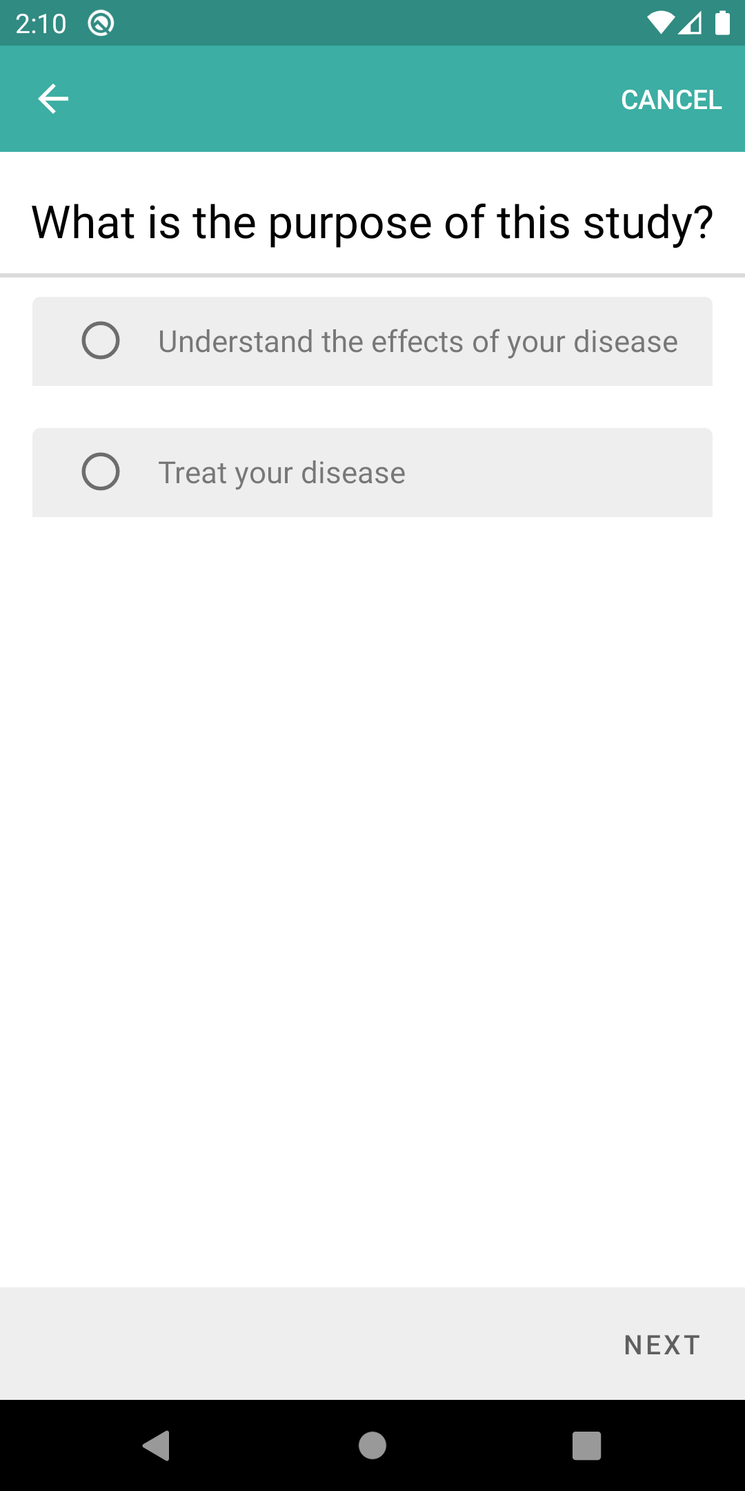
Later on... Details
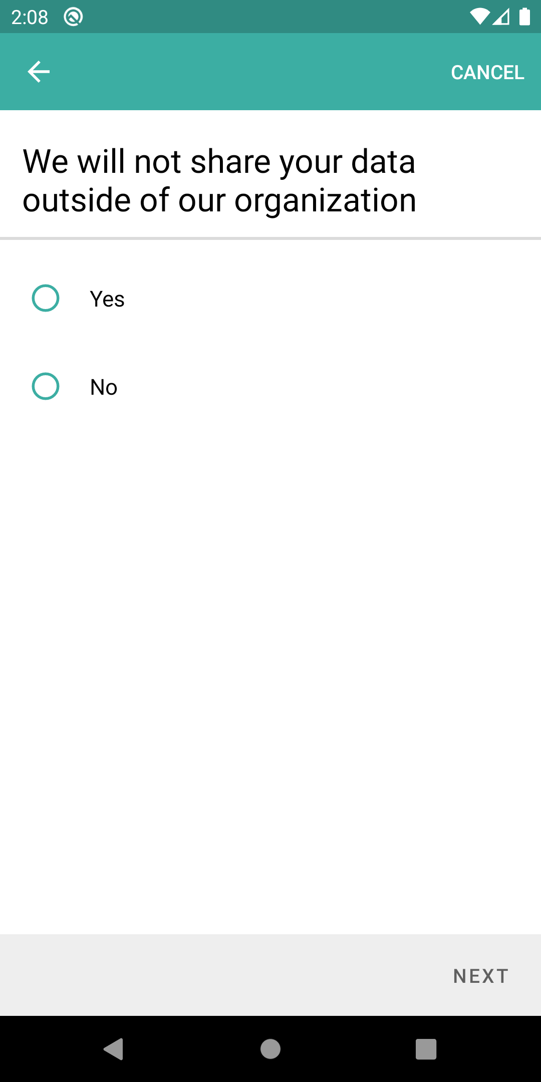
Here I see the Theme issue. The RadioButtons are themed aquamarine/teal, they should respect the primary theme of the app. This theme issue is observed across the consent so I won't repeat it. Details
In this supposed to look like that with the gray font + gray background? Details
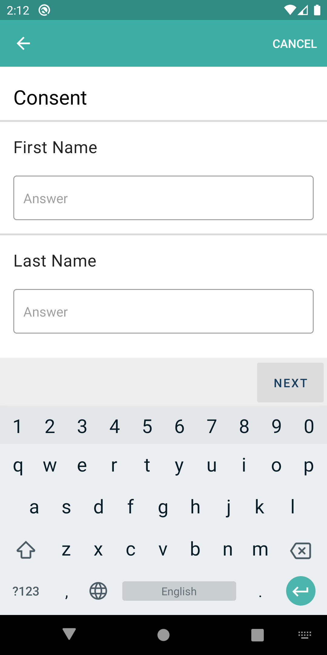
I've compared against the zeplin comp for this screen. I still think that comp is wrong, the "hint" (answer) shouldn't be there. The hint should be First Name and Last Name and they should look like that when you tap on them (sans the "answer" text). Details
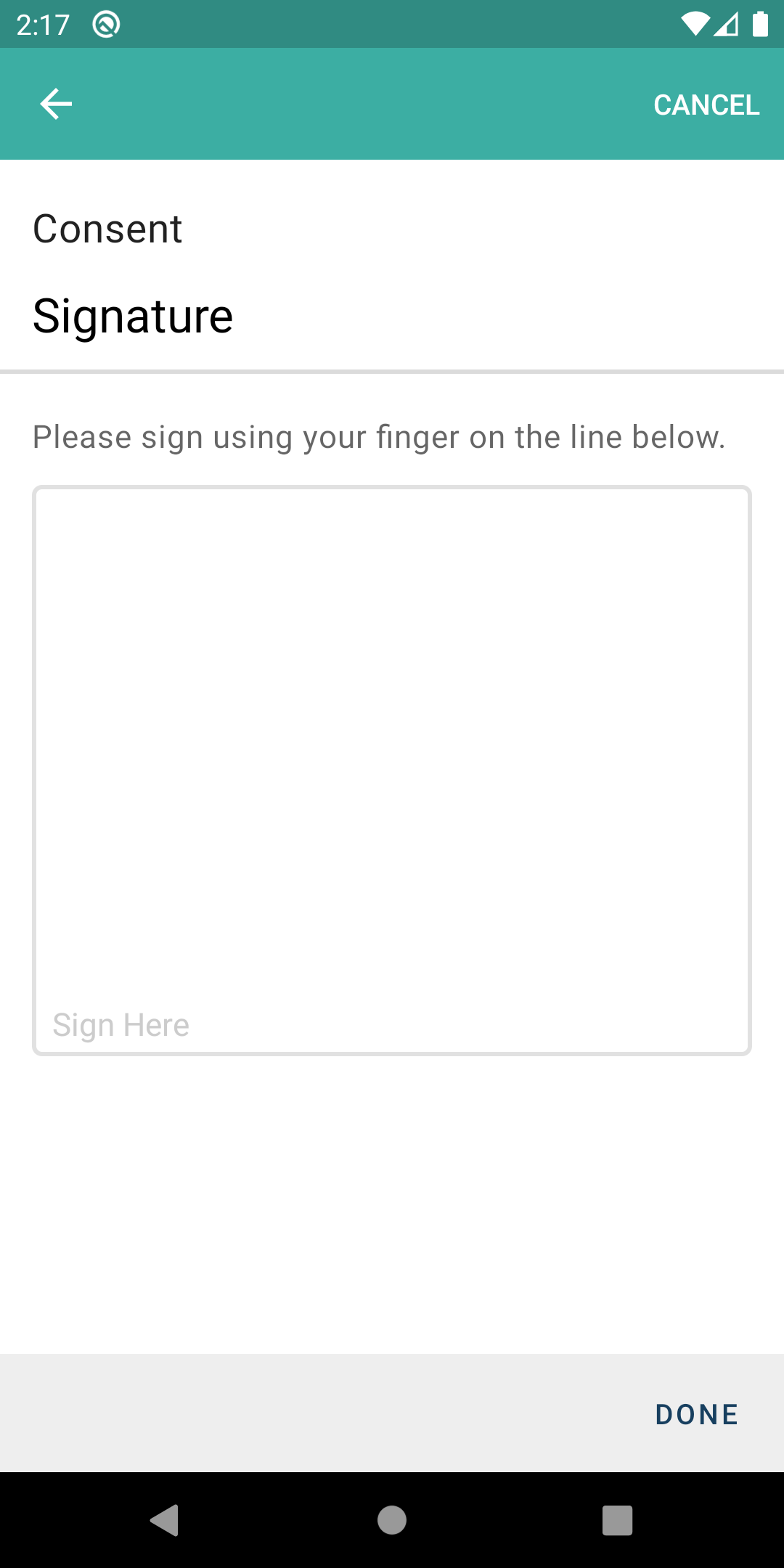
^^ The border is too thick compared to the zeplin. The paddings in Sign here are not the same, and the CLEAR button once you sign, is not centered like in the comp. Other than that, it worked fine. :) |
The consent header now is display with the primary color of the step.
I didn't change the whole theme issue, we didn't have any zeplin for it so i let it as it is :/
I change the background because it didn't fit the rest of the application but i let the gray front because it was actually something that change when the value is selected (the value selected is in black, the other are in grey).
This is also the reason why i did this like that. It's more compliant with the rest of the app ( for example the autocomplete step is done like this : zeplin)
Totally agree with that but we never use this hint behaviour anywhere on the app so i did as usual.
This is updated and normally it will be fine 🤞
Great :D PS: I will discuss with Felix about the radio button and the lastName/firstname part |
Objective
Implement the change for the completion step
Branches
SCENARIO:
Credentials:
Steps:
Expected:
Close PATAND-267